
In the 2020 VEX Robotics competition, the objective is to deposit colored cubes into your team's goal to receive points. The point value of cube color X is scaled by the number of color X which have been placed in the towers. Make the wrong move, and you may score for the opponent!
In the hands of the drivers' assistant, this app provides the best moves for our team at any point in a match.
CONTEXT

C++, V5 (VEX Robotics Language)
Stratmaster
NEED FOR AN ACCURATE SCORING TOOL
Divided Attention
Driver responsibilities include:
1. Stack blocks into goals without dropping them
2. Tracking the other 3 robots on the field
3. Being cautious of illegal driving zones and moves
4. and also doing mental math for stacking cubes.
It is near impossible to juggle all four of these tasks at once, and our team spends so much time creating the robot that there is little time left to practice driving.
High Pressure
Games are high-stress and 75 seconds in duration. Interviews with some of our drivers confirm that it is extremely easy to miscount the blocks in each scoring zone, or forget that some cannot be moved due to special rules.
Drivers must rapidly context-switch to succeed, creating the need for a reliable score-calculation system.
USER FRAMES
The overarching philosophy was to reduce friction and improve workflow with a very simple design that effectively reduced in-game errors.

1. Simplest design
2. Lists opponent's optimal moves, which we should definitely block.
Across all designs, we incorporated an alert to prevent switching teams (completely changing calculations for "best move") accidentally, and limit the app to a single screen; swiping would be too much in a game of seconds.
3. UI mimics the vantage point of the app user during a game, rotating screen so that our color will always be on the bottom.
MEDIUM-FIDELITY PROTOTYPE
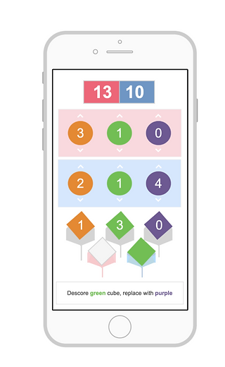
Indicates whether we are red or blue
Extra-large font: easy multitasking
VEX StratMaster and the official VEX app have a similar layout to minimize confusion on competition days, where we may alternate between the two.

Users must quickly look between the field and the app screen
Unconventional Design
Although it is usually best practice to make things obviously "clickable", we sacrifice that for a cleaner interface. This allows the user to locate exactly what they are looking for at a glance. We were also able to do this because we expect two people to use the app; both already know how it works because they helped develop the app.
TESTING: COMPETITION #1
An interview with the team member who used the app revealed that nothing more than the simplest design (#1 of User Frames) is necessary. We created it for iPad to improve visibility.
Because she primarily controlled with her thumbs, it was very difficult to change teams by accident, so we agreed to get rid of the alert for the sake of smooth work flow. However, I decided to make the team indicator more prominent since it is now possible* to change it and not notice, causing the user to wonder why the scores are calculating "inaccurately". This happened multiple times as developers were working on the app and demonstrating the prototype.
